New museum, new identity. Interview with the Oilinwater team
The search for a symbol
Quite early in the design process, the need to use a symbol became apparent. Because of the identity and the architectural trends to which the house belongs. And because it is particularly rich in symbolism, everything in this place seemed to us to have been designed to provide a visual, and emotional experience for its visitors.
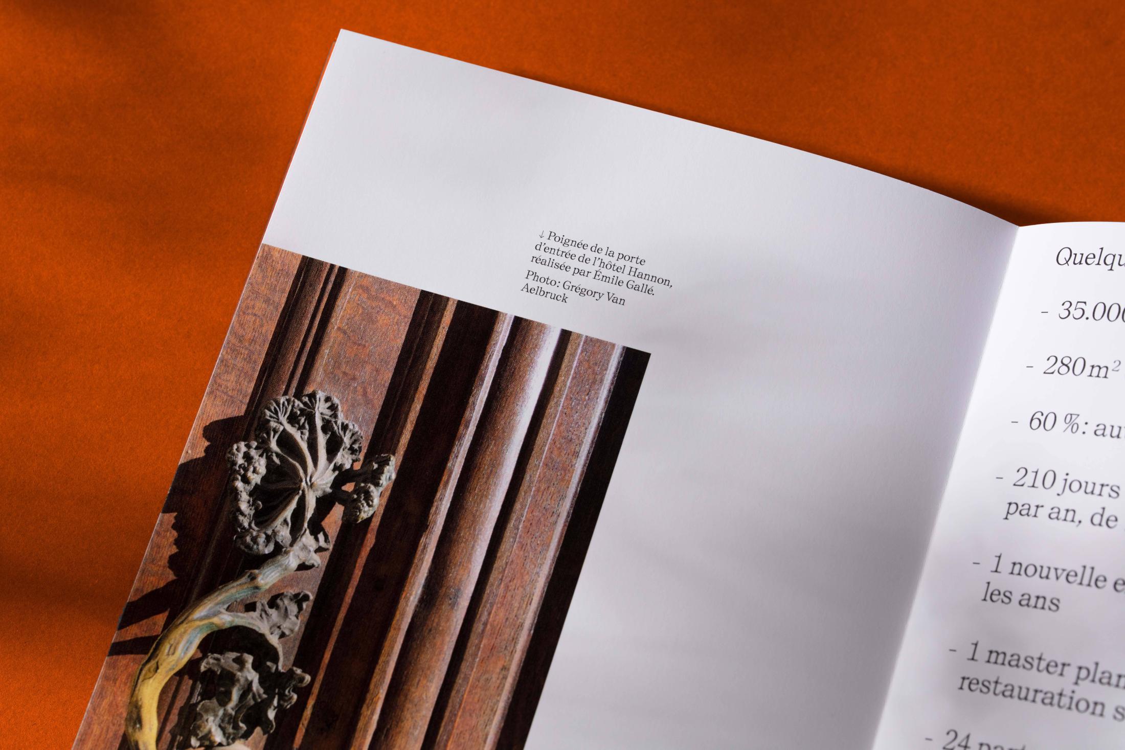
The couple Édouard Hannon and Marie Debard commissioned most of the furniture for the house from Émile Gallé, who used the umbel design in a systematic way in his work.
This flower is also used as a mold for the handle of the main door of the house, as a first point of contact with the place, as an entrance key - for the visitors of Édouard Hannon 120 years ago, and in a few months for the future public of this new museum.
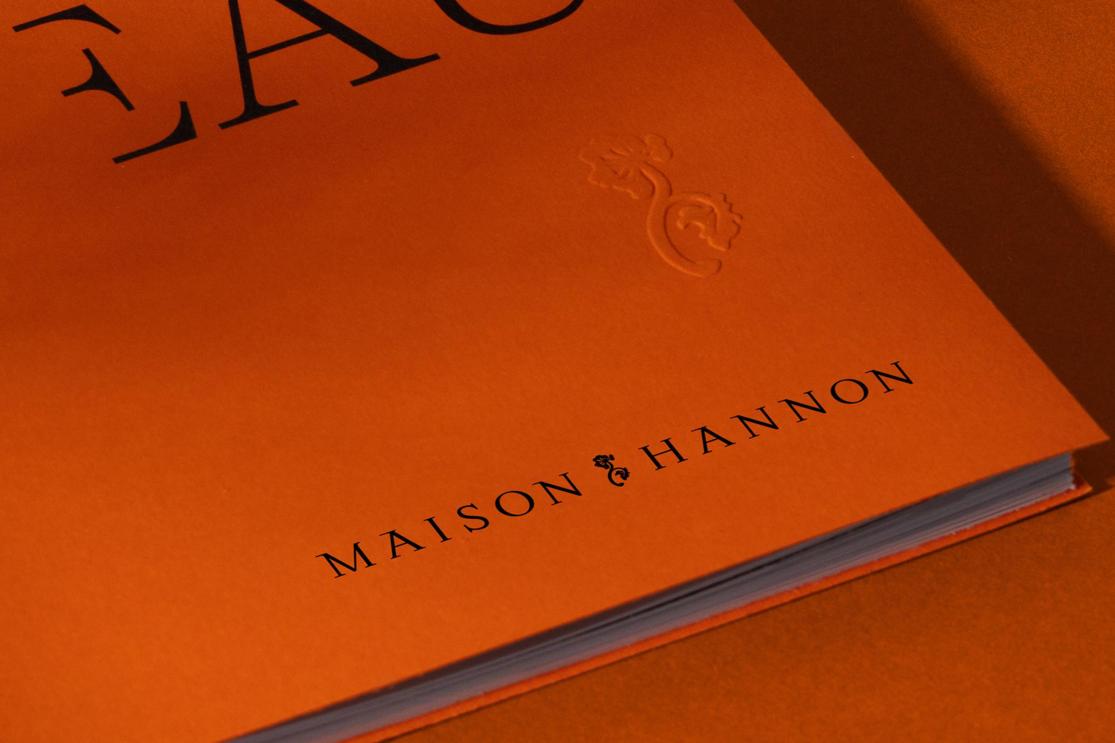
We were particularly interested in the treatment of this object because it seemed to us to be a good synthesis of the way in which Jules Brunfaut conceived the place. He used various artistic trends in Brussels at the time in a series of touches. The handle is not designed according to the principles of clear line and curve that are most expected for an Art Nouveau design in Belgium, but is a hyper-realistic, almost rocaille-style molding of the flower.
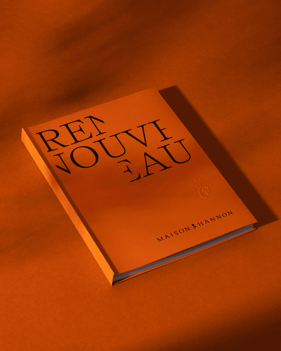
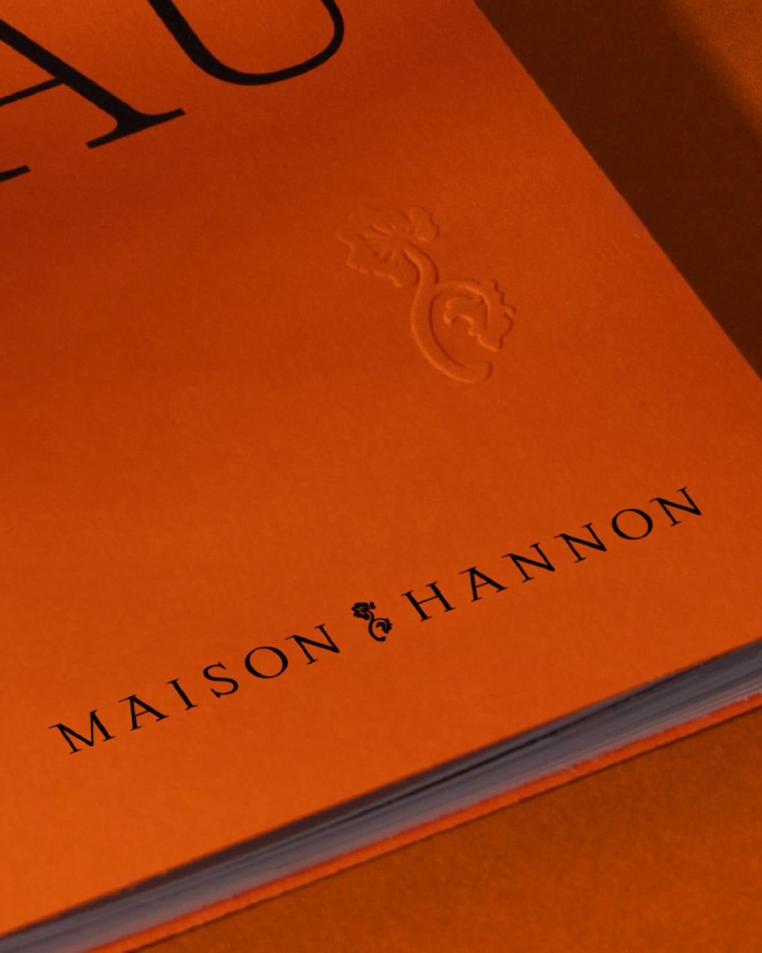
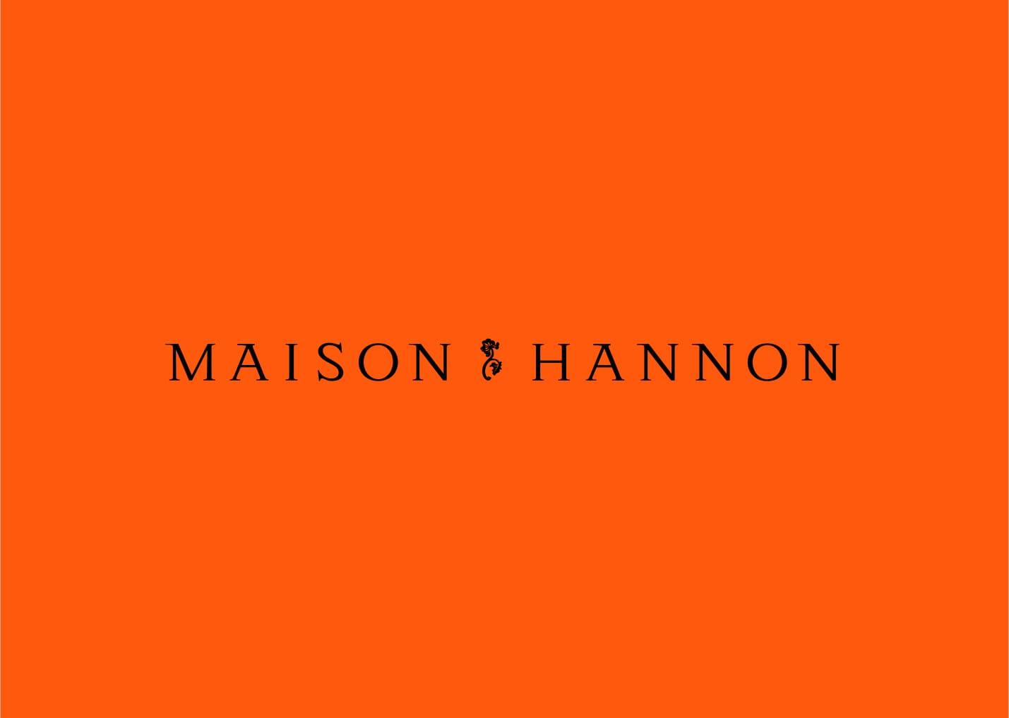
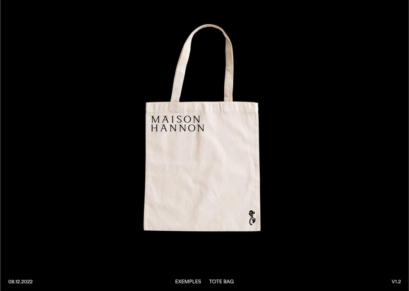
We stylized it, converted it into a two-dimensional design and used it as a visual embedding marker between the words composing the logotype. And as a seal that can also be used independently.
Like the handle, the graphic communication is also a first point of contact with the public.
Arts and Crafts
Throughout the development of the project, we felt a certain echo between what the construction site of the HANNON HOUSE must have been like, which was certainly a ballet of trades and craftsmen, each one specialized in his or her field, and our own practice.
We feel deeply that we are craftsmen in our profession as graphic designers, we produce commissioned work that will have a practical function. But we seek to give meaning and express messages in aesthetic forms. The artistic context of the time therefore speaks to us particularly from this point of view.
So we did not carry out this project alone but in collaboration with a whole team of professionals around us - typographers, illustrators, photographers, printers, bookbinders -.
Technical constraints
What also strikes us about the dynamics of the architectural movement and the ideas of the designers of this Art Nouveau period is the way in which they integrated technical innovations and constraints into the construction of buildings and objects. We also wanted to design the elements of the graphic identity in this spirit, using contemporary materials that we have today as graphic designers, for color, papers, and typography.
We wanted to echo the identity of the place and achieve a certain kind of timelessness, without trying to imitate the past.